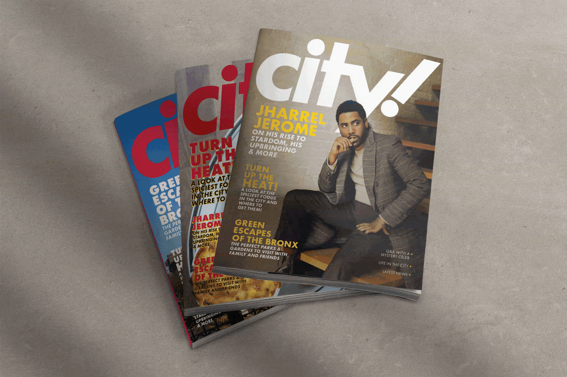
CITY MAGAZINE
A magazine that centers around life in New York City.
A magazine that centers around life in New York City.
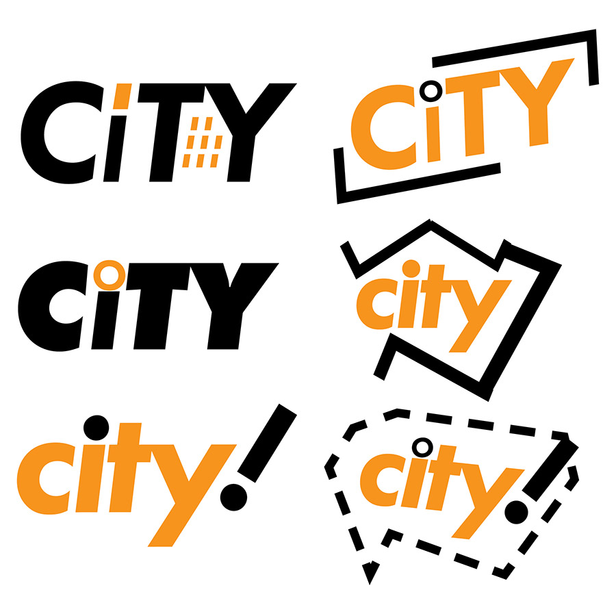
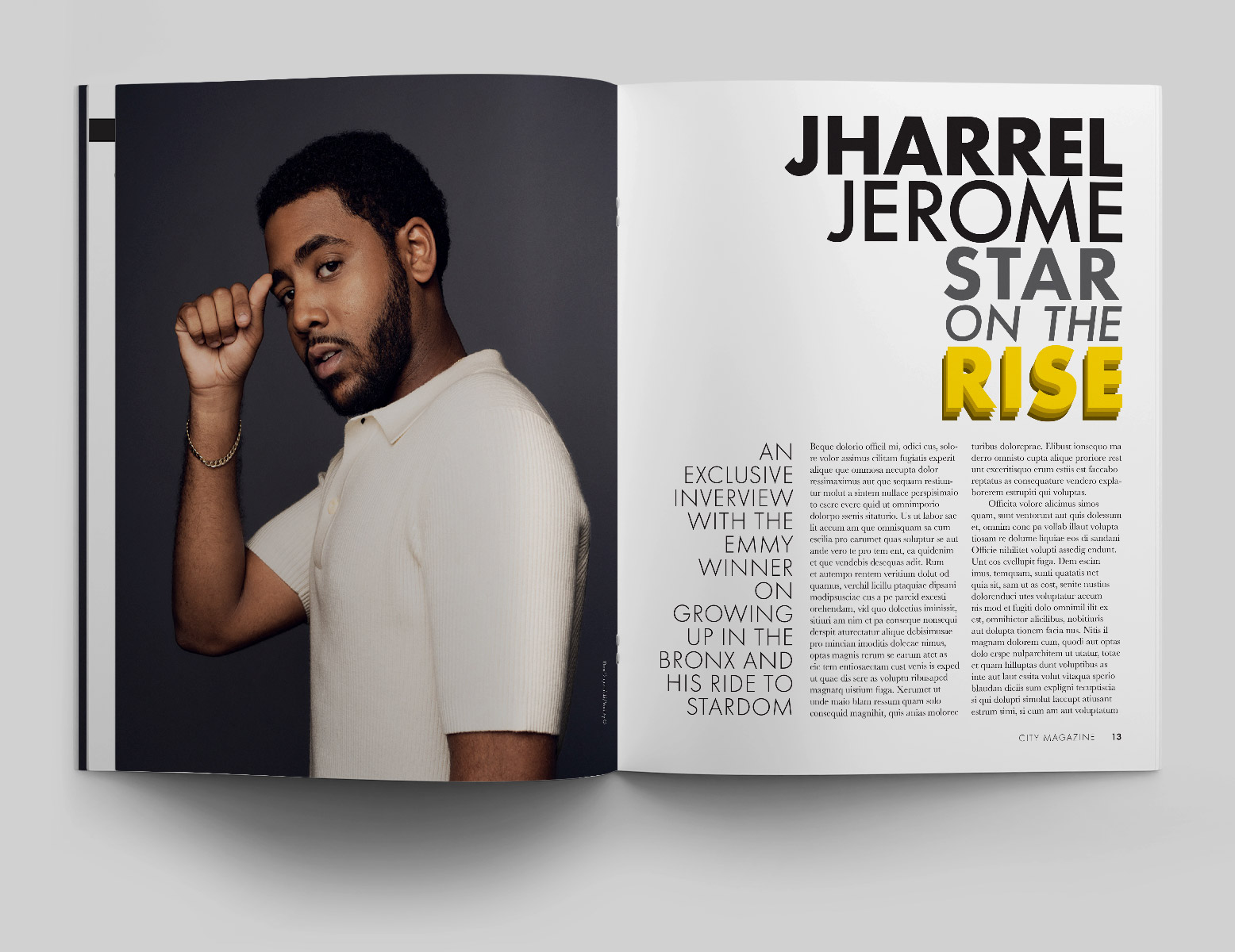
Since the magazine centers around life in NYC, I used Futura PT for the logo because it’s a geometric sans-serif and I wanted the logo to be modern and fun, just like the city. In the beginning, I played around with the idea of integrating a building or a speech bubble into the logo, but decided the logo with an exclamation point worked best at the time.
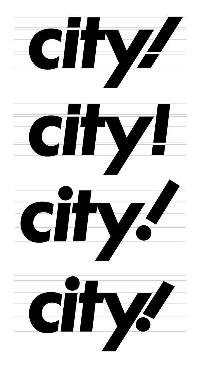
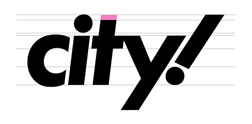
1) Extended the top of the exclamation point so that it lines up with the dot of the 'i'.
2) Extended the top of 't' so that it lines up with the dot of the 'i' and the top of exclamation point.
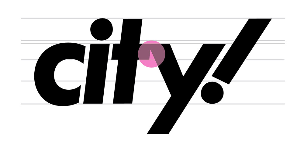
3) Closed the awkward gap between the 't' and the 'y' in order to bring it all together.
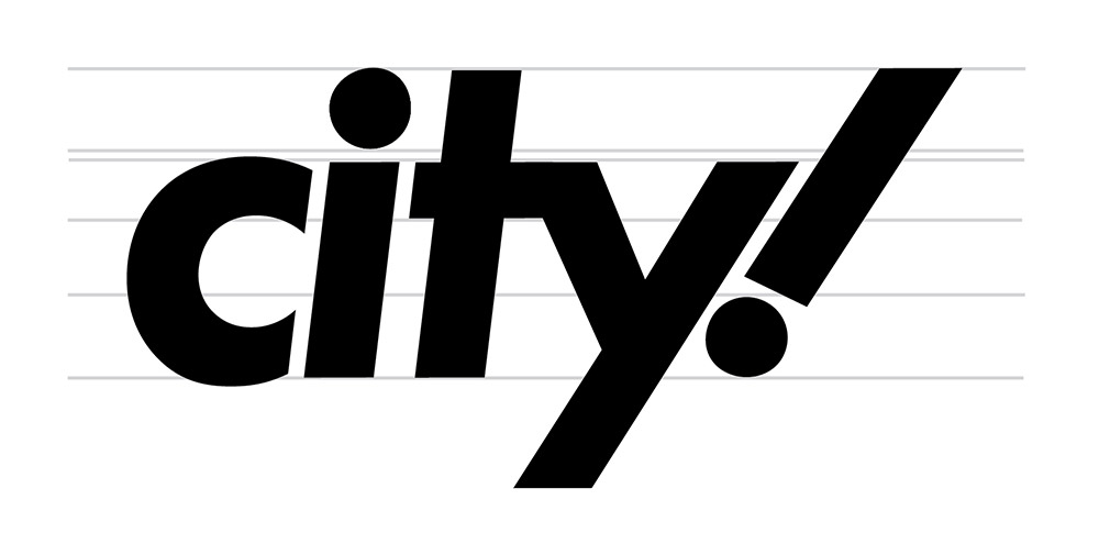
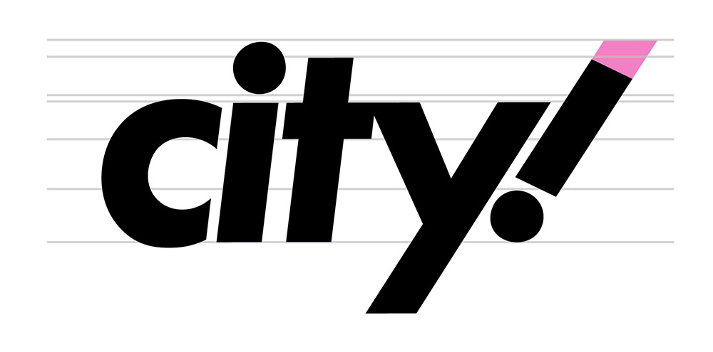
4) Final stage of the logo.

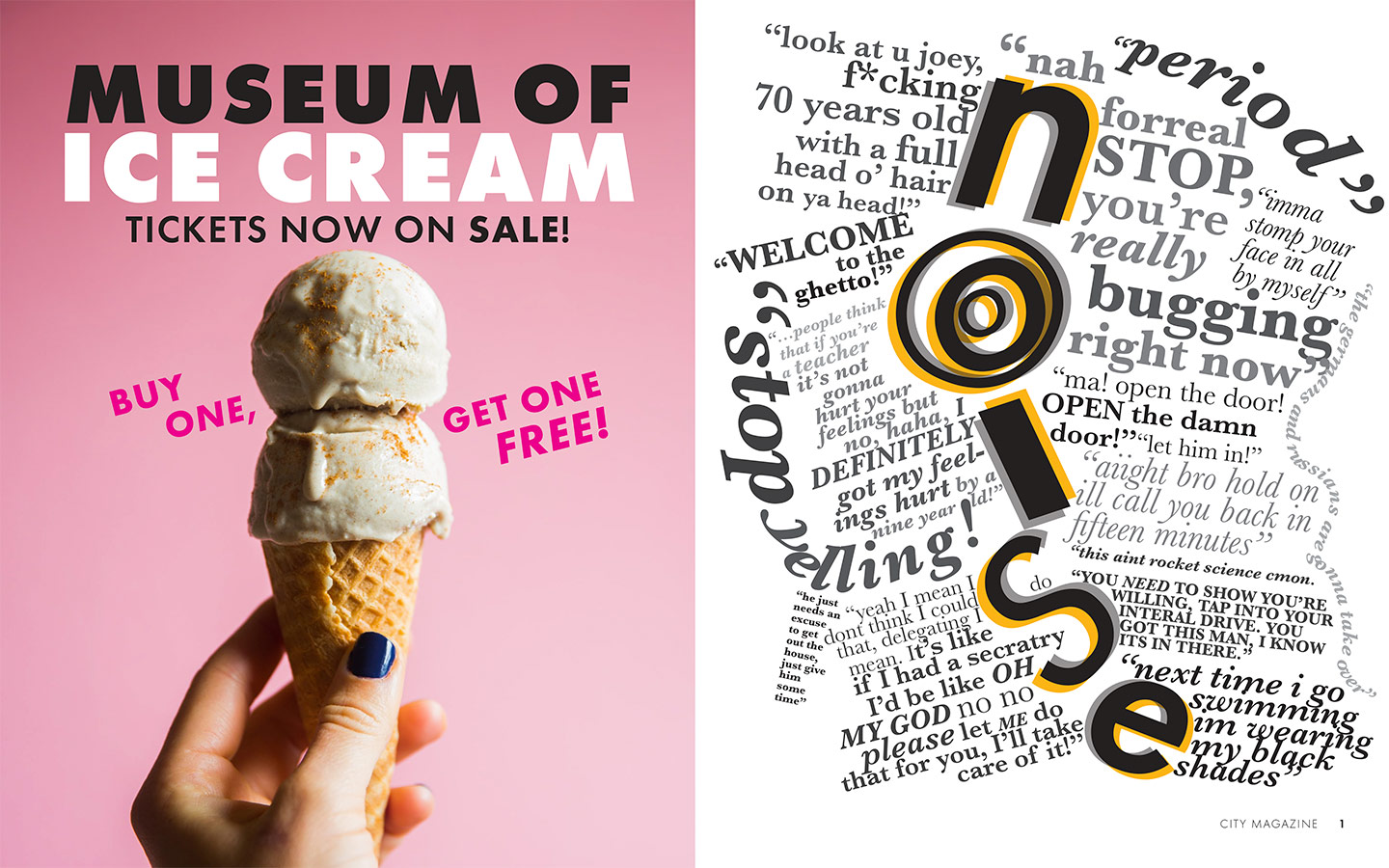
Left: An advertisement for the Museum of Ice Cream. Right: A page titled "noise", which features dialogue heard directly from the streets of New York.
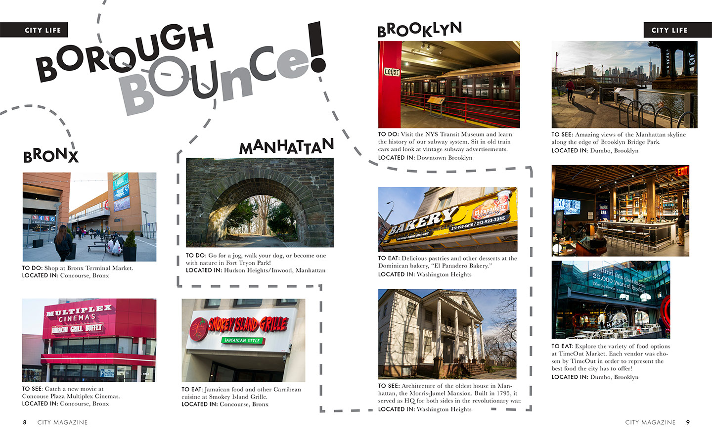
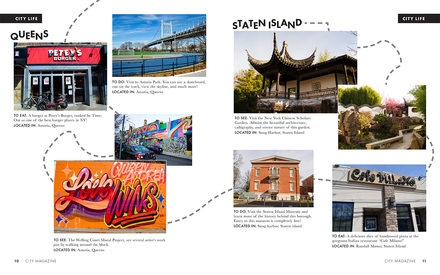
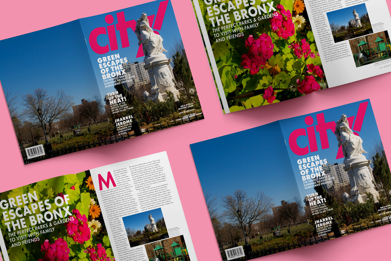
The "Borough Bounce" section highlights different places that New Yorkers can travel to within each of the five boroughs in order to have fun, see new places, or eat new dishes.
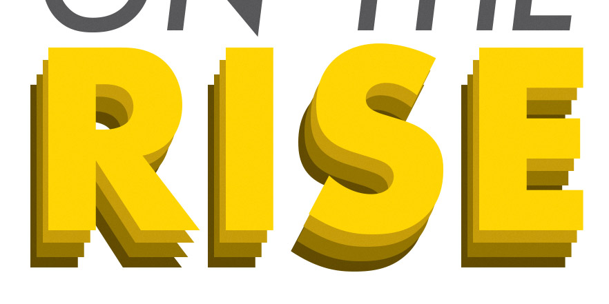
The word 'RISE' is stacked upon itself several times and also increases in saturation in order to create a lifting effect.
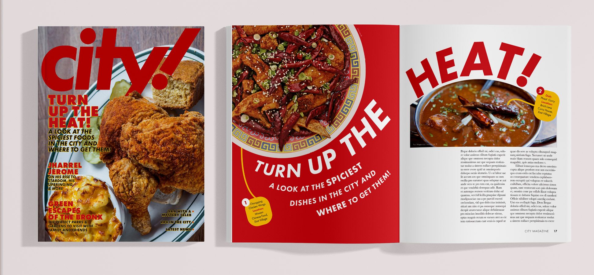
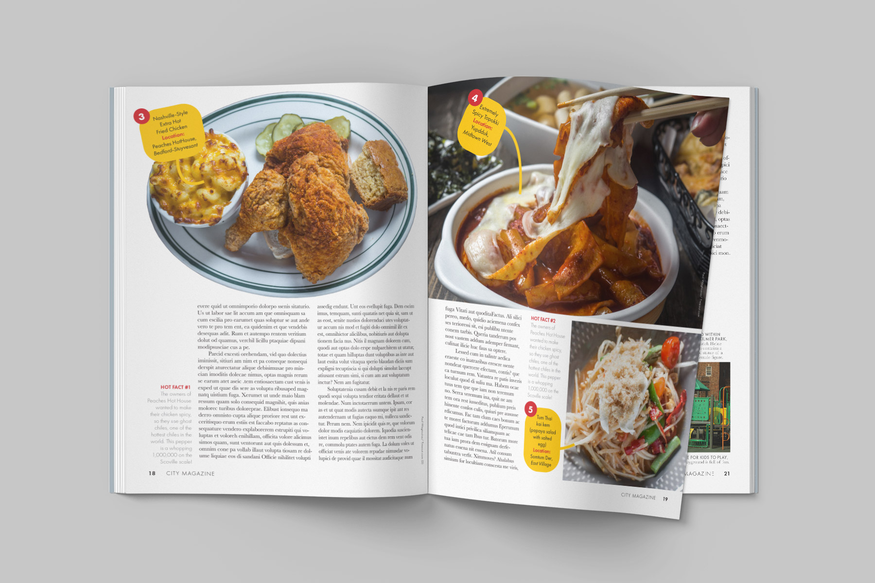
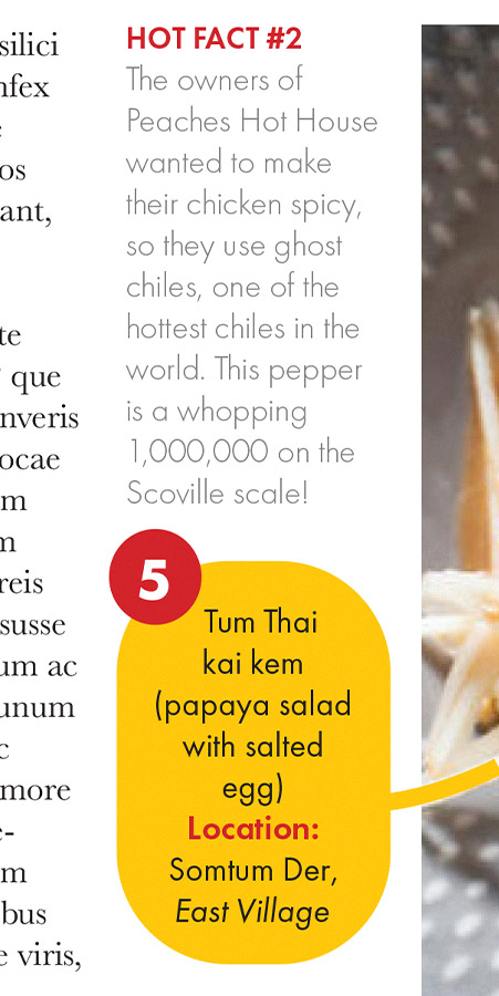
Each dish is numbered in order from 1 to 5 and is labeled by name and location. Some fun facts about the dishes are also included as sidebars.
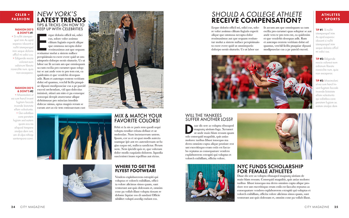
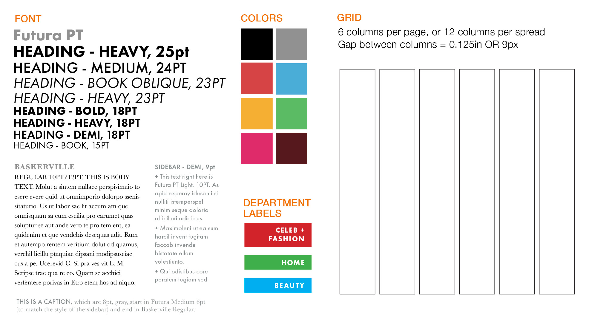
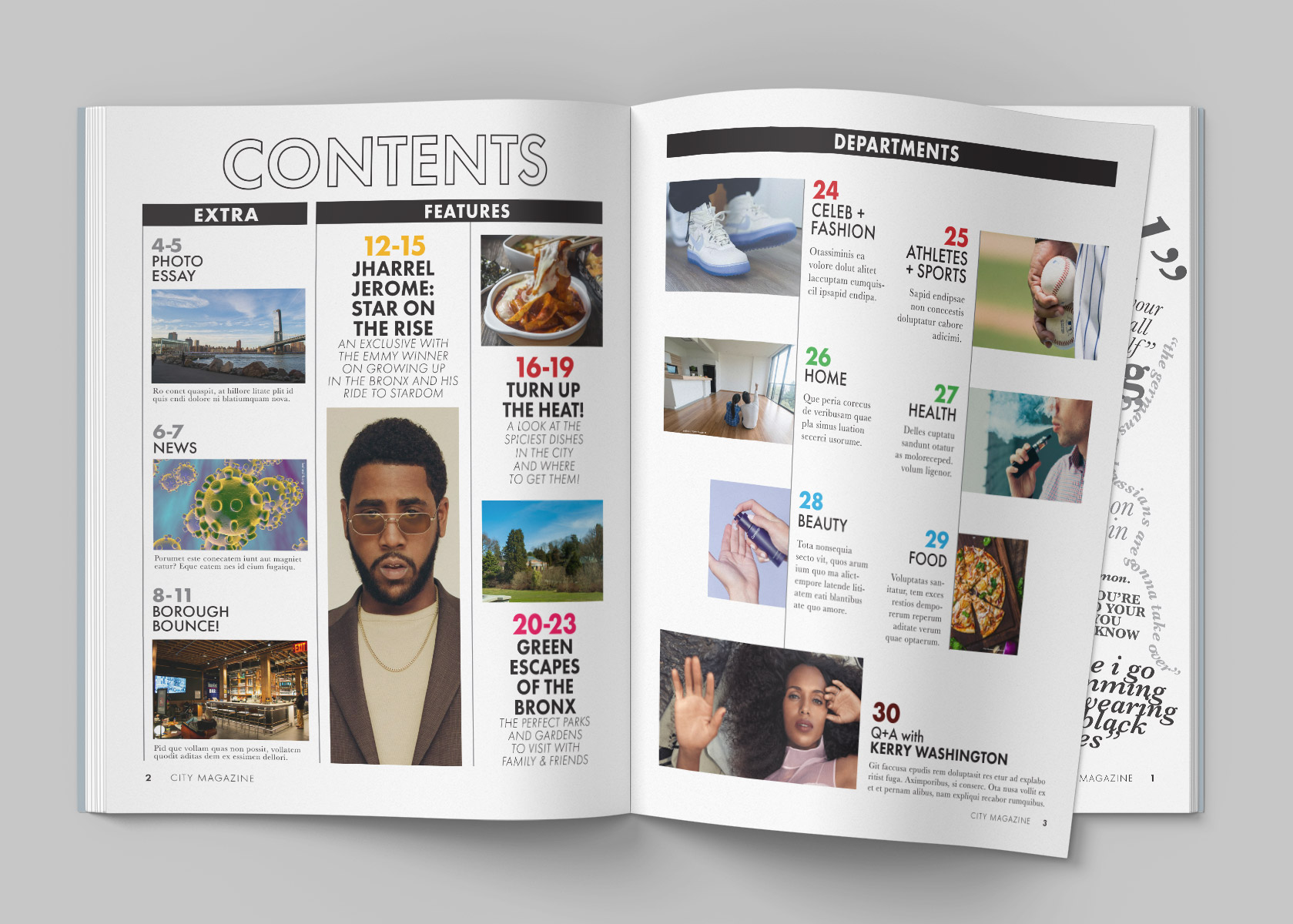
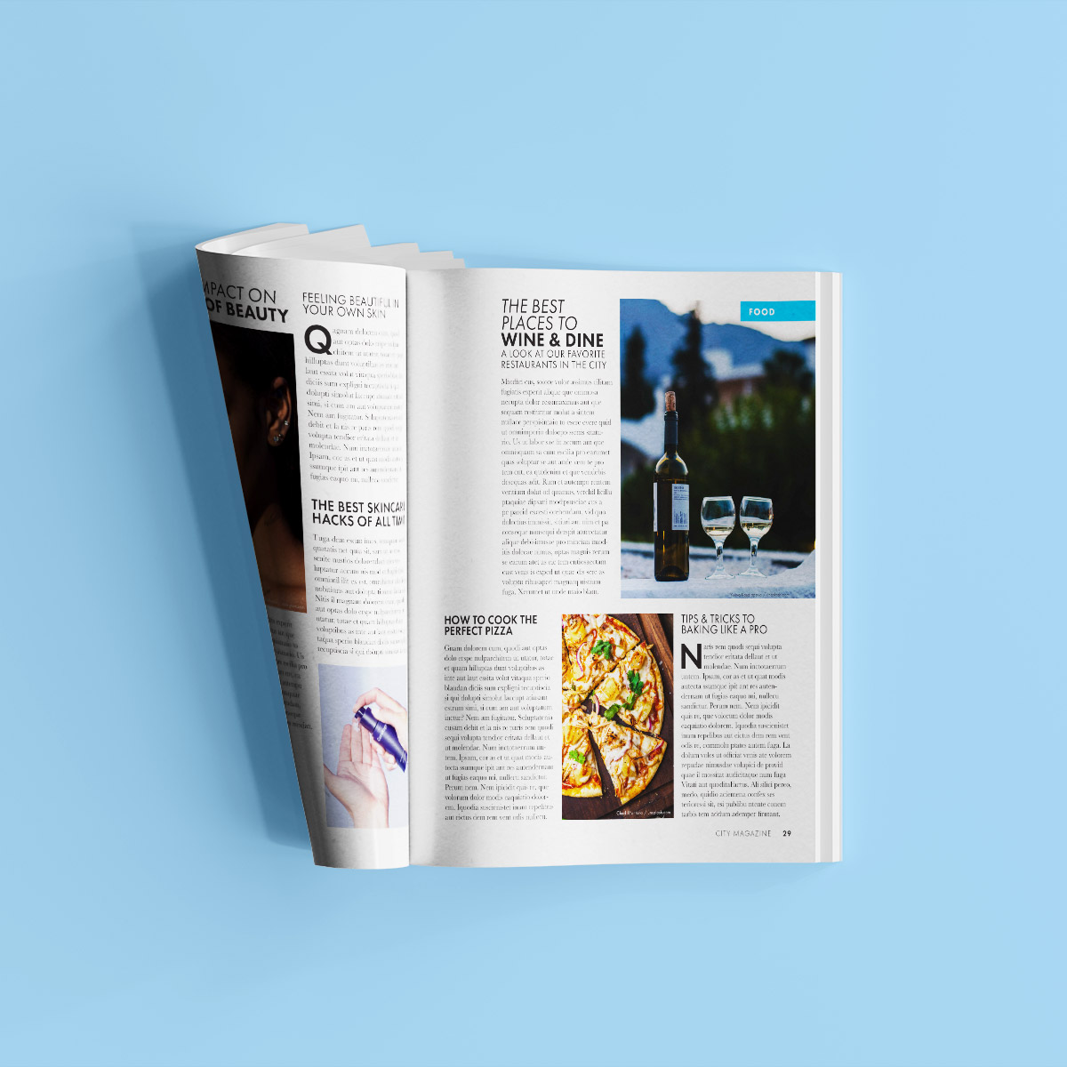
There are different spreads for different departments (celeb + fashion, home + health, and beauty + food) . Each section has a designated color and label.
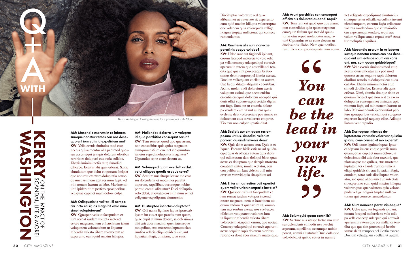
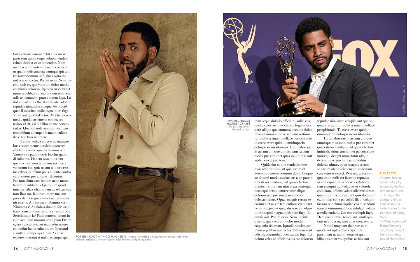
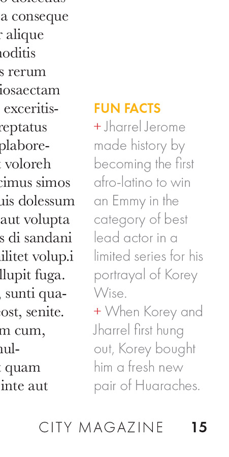
Bonus celeb interview with Kerry Washington.